Ever wonder what happens when you drop one of the country’s busiest airports into the middle of a dry lake bed without radar? Paul Eastham knows exactly what that looks like.
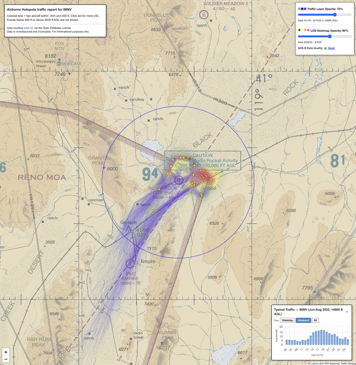
As one of the managers for Black Rock City (88NV), the temporary strip serving Burning Man in the Nevada desert, Paul watched controllers manage up to 30 aircraft at a time. It was a high-workload environment where safety relied entirely on “eyes-out” flying and pilot radio reports.
When ADS-B became a requirement, Paul — a retired Google engineer and pilot — saw an opportunity to stop guessing. He set up screens to give controllers their first visuals of the traffic, using ADS-B data, and what he found changed the way he flies.
Burning Man Genesis
That Burning Man epiphany became Airborne Hotspots.
“88NV is one of the 100 busiest airports in the country during the event,” said Eastham.
“After Burning Man, I analyzed the full 2022 ADS-B dataset,” he continued. “We found two areas of concern.”
The first was faster aircraft overtaking slower aircraft while flying the sightseeing route. The second was some sightseeing aircraft breaking off into the base leg of aircraft in the pattern to land at 88NV.
Eastham termed these events as Loss of Separation (LOS). An event is logged when two aircraft are within 0.3 nm horizontally and 40 feet vertically.
88NV changed its procedures for 2023, introducing a 120-knot speed limit for sightseeing and telling pilots to stay at altitude longer after leaving the sightseeing pattern. These changes worked. LOS events dropped by 70% in 2023. And they have not returned.
Mapping the “Purple Busyness”
The website analyzes terabytes of data from adsb.lol, an open-source service with live and historical ADS-B data for research. (Eastham was quick to give adsb.lol credit for making this data available and archiving it.) Eastham parses the data on his laptop before it is uploaded to the website.
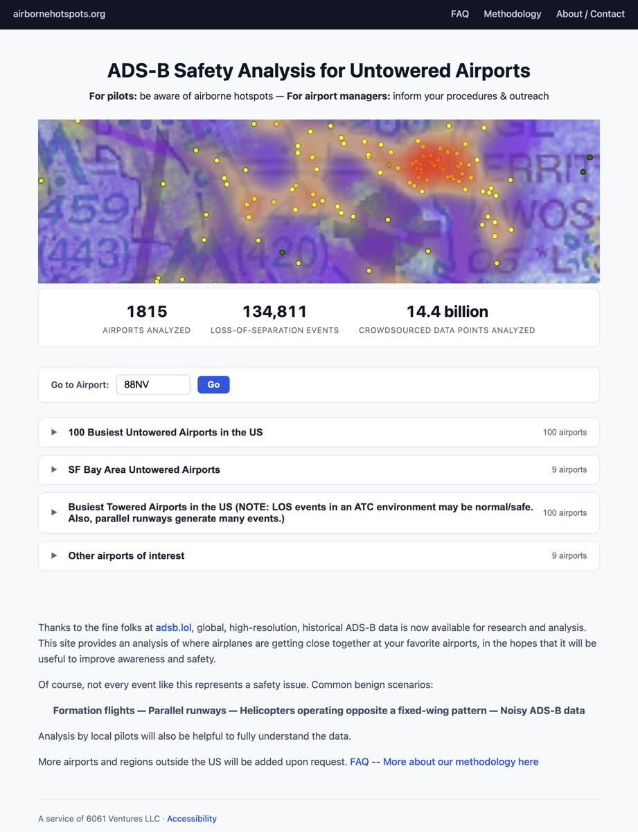
The site’s current dataset includes 1,815 airports and tracks more than 134,800 LOS events from 14.4 billion data points.
Users can interact in the following ways:
- The Traffic Layer: Aircraft paths show up as blue or purple lines. The thicker the line, the more traffic along that route. This allows pilots to visualize the “invisible” traffic flows at unfamiliar airports.
- LOS Hotspots: Yellow to red-shaded areas on the map. These heat maps show where close calls are concentrated.
- Interactive Event Playback: Each dot represents a specific LOS situation. Clicking an event shows an animated replay of the event.
Beyond the Pattern
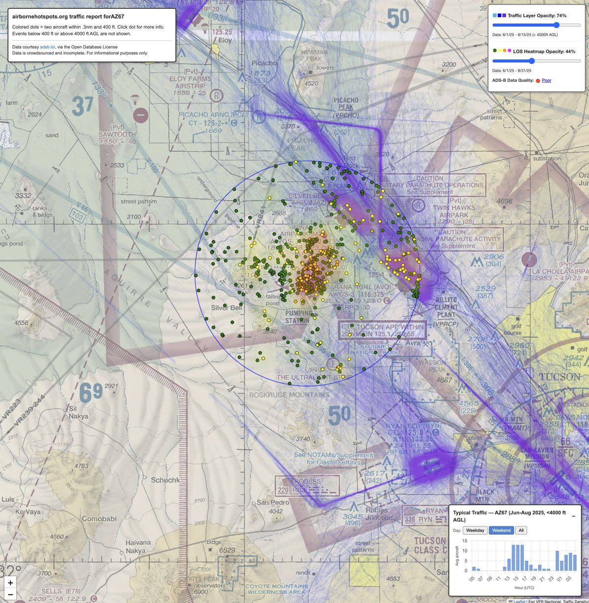
The data is also useful outside of standard airport patterns. Eastham helped El Tiro Gliderport (AZ67) near Tucson use Airborne Hotspots out of concern that “non-participating powered aircraft were intersecting with their gliders,” he said.
The data showed that most conflicts happened near the airport, not over the mountains as expected. This helped El Tiro officials warn pilots about specific risky areas.
The traffic layer could also help to prevent navigation accidents. Eastham mentioned a tragic crash near Salt Lake City when a pilot flew into a boxed canyon.
“If you look at the purple routes around Salt Lake City, the data shows nobody going into this canyon,” Eastham said.
He believes that apps like ForeFlight or Garmin Pilot could use these layers to alert pilots flying into unusual or unfamiliar areas.
A Tool for Education, Not Enforcement
The data is powerful, but the site does produce “false positives.” Examples include formation flights, parallel runway operations, and helicopters flying opposite patterns. These events are not always unsafe, Eastham pointed out.
Eastham does not want to be a “traffic cop.” He doesn’t use the data to judge pilots. He wants to move aviation safety toward data-driven insights, not anecdotes.
The data even changed his own flying habits.
A pilot in the San Francisco area, he was always particularly concerned when flying over the ocean. But looking at the data made him realize the real hazards were at area airports where traffic is heavy from training flights.
“I was looking in all the wrong places for traffic,” Eastham admitted.
“I’m still careful over the beach, but I’m definitely paying more attention in certain high traffic corridors,” he said. “Also, I’m much more careful crossing overhead airports.”
He now crosses airports at 1,000 feet above the pattern. He used to cross 500 feet above the traffic pattern.
Time spent at Airborne Hotspots may also give pilots a broader perspective for safer operations, he concluded.
This is great visualized data! Our flight school’s SMS gets a number of NMAC safety reports each year. While I can pull the data from Flight Aware into Google Earth for visualization and review, it is only after receiving an anonymous report with enough data to find the correct flight and time. I have been looking for a tool like this to find unreported issues and to look for potential mitigation opportunities. New LOS event notifications would be a great future improvement.